Drake — Legacy Desktop Tax

Drake's workhorse, desktop-based tax preparation software.

Roles

  • UX Design
  • Page Copy

Visit Drake Website

Drake Legacy Desktop Tax

Modernizing a workhorse desktop app without disrupting the people who depend on it.


My role Led UX design for targeted legacy-to-modernization improvements, partnering with engineering and product to clarify requirements, produce UI recommendations, and validate direction quickly
Scope Product + engineering + support lead input | Migration workstream | Legacy desktop screens, Power Basic to C# modernization, high-friction workflows and error-prone data entry
Challenges and constraints Minimal upfront requirements, legacy desktop constraints, and an active migration from Power Basic to C# with a need to avoid disruption for a highly trained user base
Impact Reduced user confusion on high-friction screens, improved workflow clarity, and supported Support call reduction by modernizing patterns and tightening information presentation
Skills demonstrated Legacy modernization UX, interaction design for desktop constraints, information simplification, rapid validation, pragmatic UX writing, partnering with engineering through migration work

Drake's legacy desktop product was mid-migration from Power Basic to C# when I joined the effort. That transition created a practical opportunity: rather than simply porting existing screens, we could address longstanding usability problems at the same time.

Requirements often came in thin, so I worked quickly to clarify intent with the engineering lead, then focused redesign efforts on the screens most likely to reduce support calls. The goal was to simplify data presentation and task flows in ways that felt like a natural evolution to a user base that knew the product deeply and didn't welcome disruption.


Key decisions
Summary: prioritize support drivers, simplify hierarchy, make next actions explicit
Prioritize the screens driving support calls
DecisionFocused redesign effort on a short list of high friction screens consistently generating support demand
TradeoffDid not attempt broad modernization across the desktop product, kept scope tied to the highest impact areas
WhyTax season pressure and change aversion required targeted wins without disruption
ResultReduced support drivers in prioritized areas and improved clarity where users most often got stuck
Trade dense layouts for clear hierarchy and fewer mistakes
DecisionSimplified hierarchy and tightened layout so critical fields and actions were obvious at a glance
TradeoffReduced density in favor of scanability, accepting slightly more screen space usage
WhyDense presentation was contributing to mis-entries and missed procedural steps
ResultFewer procedural errors in walkthroughs and cleaner QA defect patterns by feature area
Make next actions explicit instead of implied
DecisionRedesigned screens to surface the next step and transition logic directly in the UI
TradeoffAdded small guidance cues rather than relying on legacy training assumptions
WhyUsers should not need tribal knowledge to complete critical flows under time pressure
ResultUsers could describe what to do next without prompting in quick internal validations

Outcomes
Summary: lower support drivers, fewer mis-entries, clearer next steps
  • Support load
    Baseline: A cluster of high friction screens consistently generated support calls during tax season
    Change: Modernized the most problematic screens during the Power Basic to C# migration
    Evidence: Support call driver review and guidance from the Drake support lead on what to prioritize
  • User error rate
    Baseline: Dense, poorly organized screens led to mis-entries and missed steps
    Change: Simplified hierarchy and tightened layout to make "what matters" obvious
    Evidence: Internal walkthrough observations and QA defect patterns by feature area
  • Workflow clarity
    Baseline: Next actions were implicit and users relied on prior training to proceed
    Change: Steps and transitions made explicit in redesigned screens
    Evidence: Rapid internal validation sessions during sprint delivery
What changed in the product
  • High friction screens redesigned with cleaner data presentation and clearer task structure
  • Legacy patterns replaced with C# equivalents that reduced clutter and surfaced next steps
How we measured

Support call driver review to identify target screens, followed by rapid internal prototype validation to confirm directional improvement before shipping

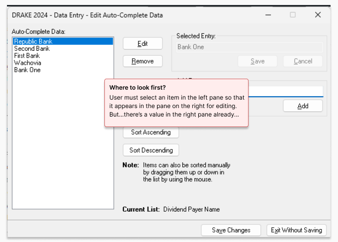
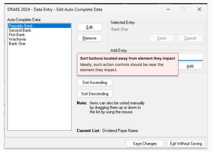
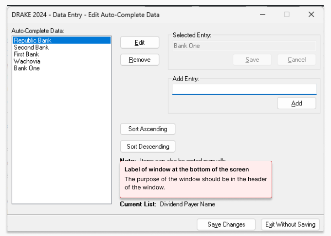
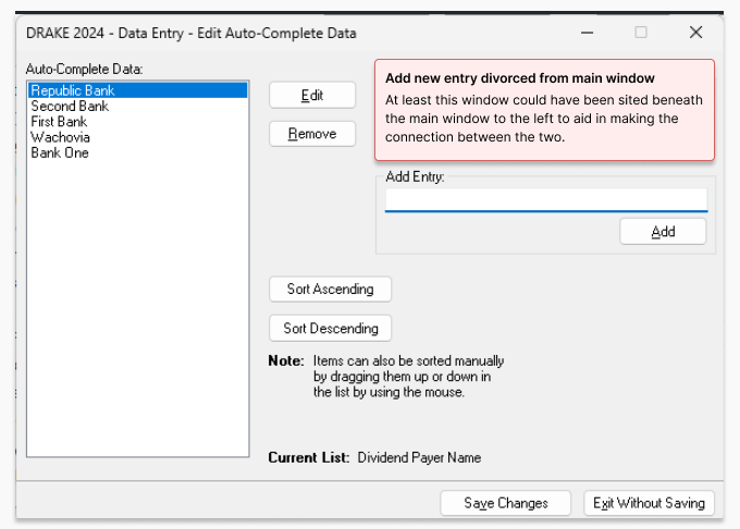
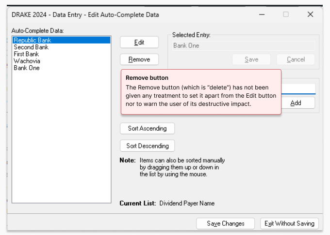
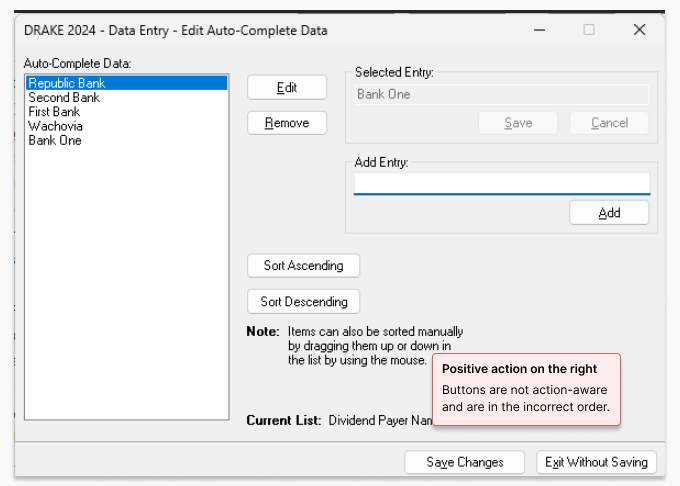
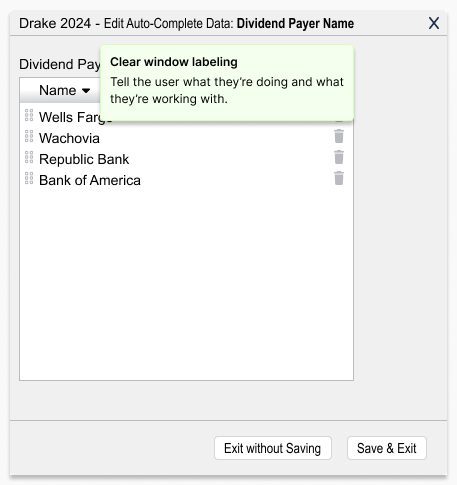
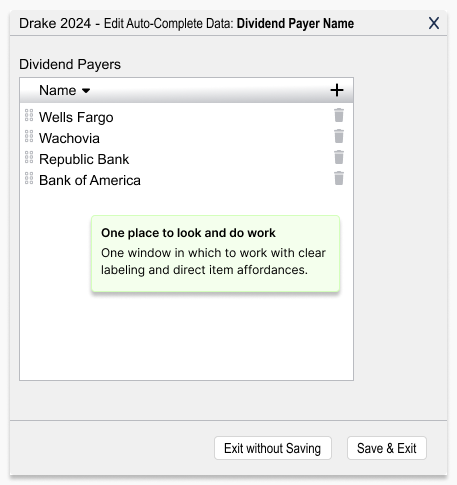
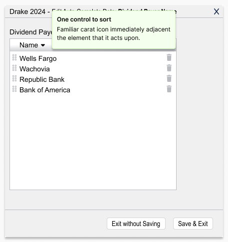
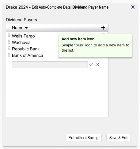
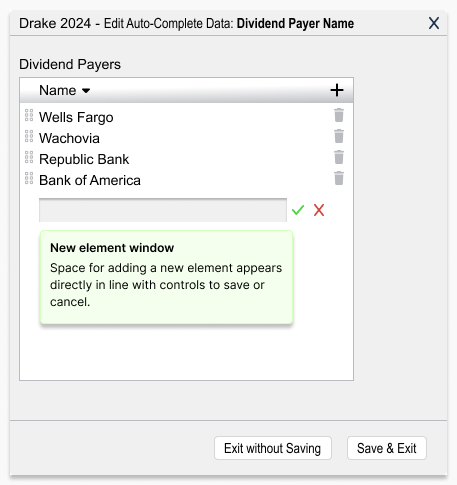
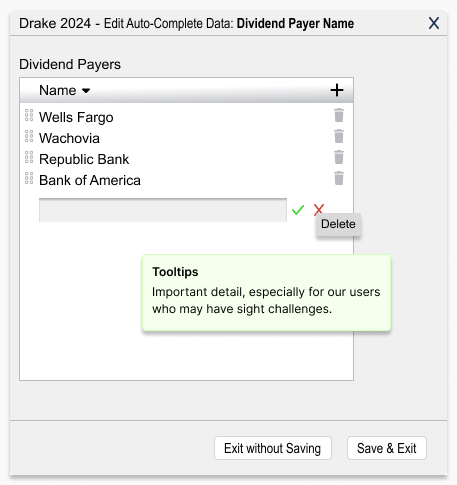
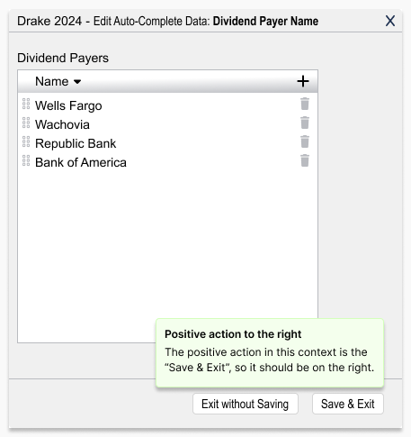
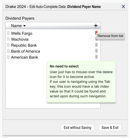
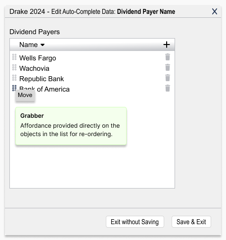
Below, I show the original screens with the issues called out, followed by my redesigned versions. When time allowed, I sanity-checked changes with quick prototype reviews with colleagues.

“Incremental improvements go a long way in helping to retain our dedicated user base.”

— Drake Professional Product Team

Get in touch

I'd love the opportunity to discuss how my skills and experience can align with and support your organization's goals.

Contact me on LinkedIn