Drake's workhorse, desktop-based tax preparation software.
Enhancing User Experience and Reducing Support Calls.
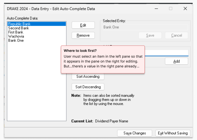
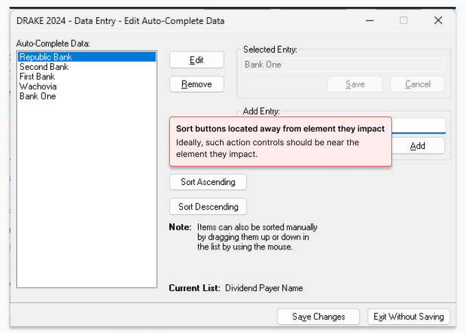
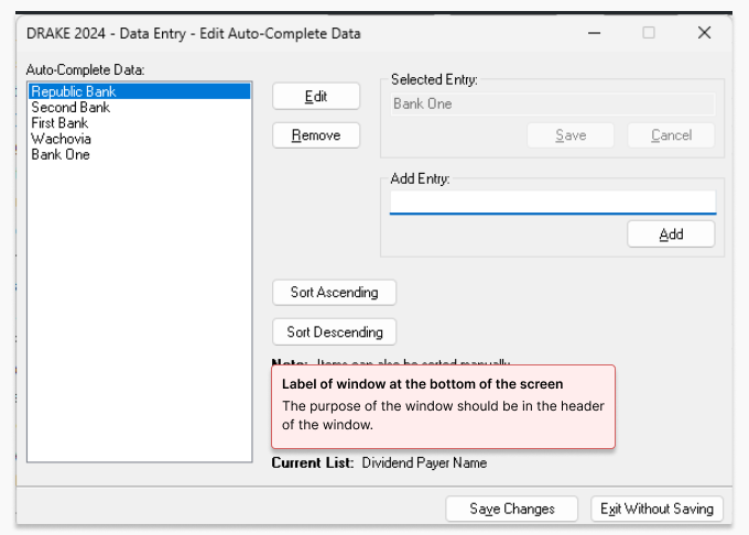
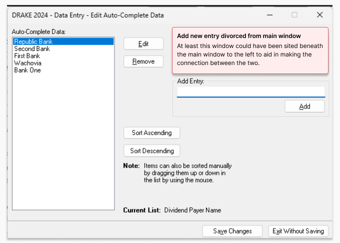
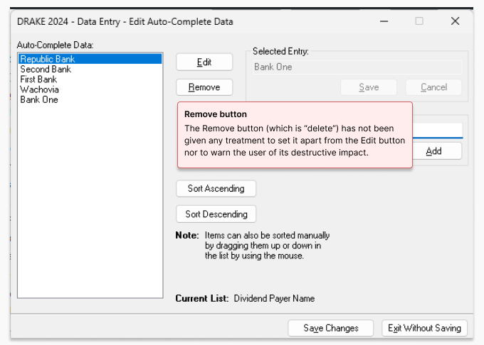
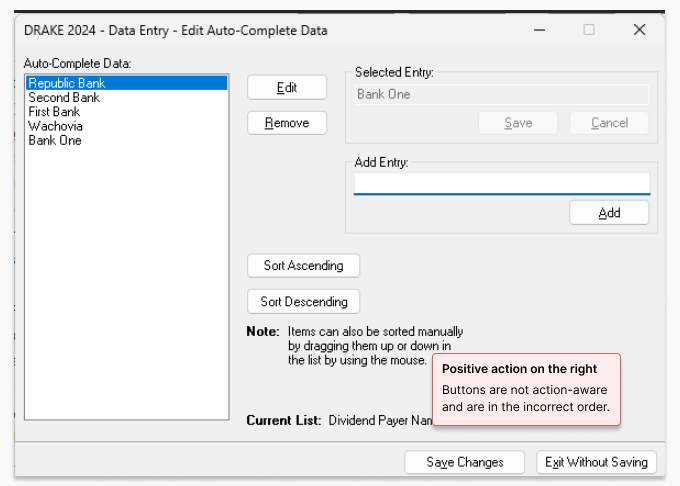
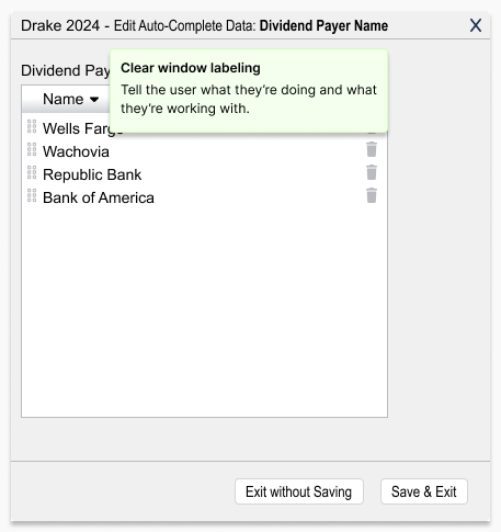
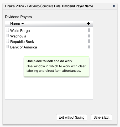
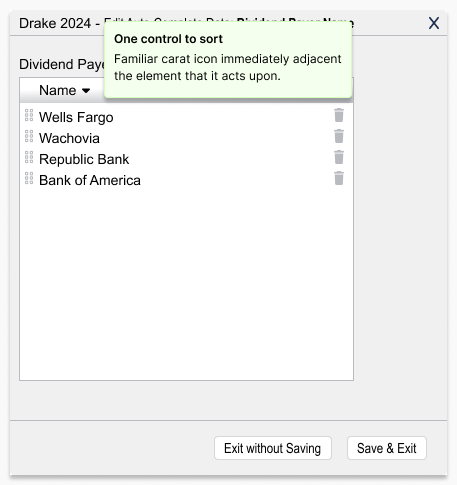
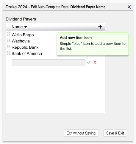
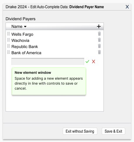
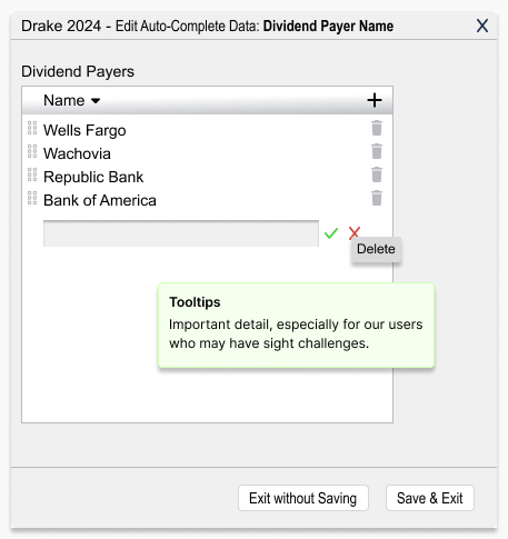
Updates to Drake’s legacy desktop platform often came in with minimal requirements, so I clarified intent quickly and focused on usability improvements: clearer data presentation and simpler task flows. During the Power Basic to C# transition, I redesigned outdated screens that were driving Support calls, aligning the new UI with the modernization effort and reducing user confusion.
This collaboration allowed me to deliver meaningful improvements: reducing user confusion, streamlining workflows, and ensuring the new system aligned seamlessly with the ongoing modernization effort.
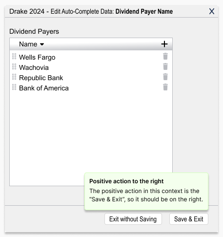
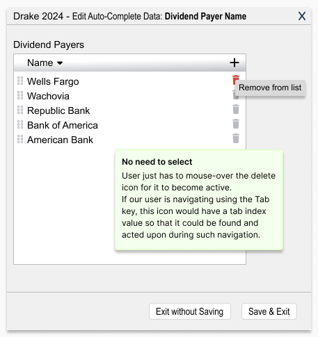
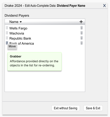
Below, I show the original screens with the issues called out, followed by my redesigned versions. When time allowed, I sanity-checked changes with quick prototype reviews with colleagues.
“Incremental improvements go a long way in helping to retain our dedicated user base.”
— Drake Professional Product Team
I'd love the opportunity to discuss how my skills and experience can align with and support your organization's goals.